Mastering Candlestick and Chart Patterns
A Visual Guide to Profitable Trading
A Visual Guide to Profitable Trading
Technical analysis is a methodology used to forecast the direction of prices through the study of past market data, primarily price and volume. Unlike fundamental analysis, which focuses on a company's intrinsic value, technical analysis concentrates on patterns of price movements, trading signals, and various analytical charting tools to evaluate a security's strength or weakness.
Definition: Technical analysis is the study of historical price action to forecast future price movement, based on the belief that market price reflects all available information and moves in patterns that tend to repeat over time.
Technical analysis is founded on three key principles:
Technical analysis and fundamental analysis represent two distinct approaches to market analysis, each with its own strengths and appropriate applications:
| Factor | Technical Analysis | Fundamental Analysis |
|---|---|---|
| Focus | Price and volume patterns | Intrinsic value of assets |
| Time Frame | Short to medium term | Medium to long term |
| Data Used | Historical prices, volume, open interest | Financial statements, economic data, industry trends |
| Goal | Identify entry and exit points | Determine if an asset is over or undervalued |
While both approaches have merit, many successful traders combine technical and fundamental analysis to make more informed trading decisions. Technical analysis excels at timing entries and exits, while fundamental analysis helps identify which assets to trade and the underlying factors driving price movements.
Price action—the movement of price over time—is the foundation of technical analysis. It reflects all market forces, including supply and demand dynamics, market sentiment, and trader psychology. By studying price action, traders can:
Tip: When analyzing price action, focus on multiple timeframes to gain a comprehensive view of market dynamics. A pattern might look significant on a smaller timeframe but could be just noise within a larger trend.
Technical analysis can be applied across various timeframes, from tick charts for scalpers to monthly charts for long-term investors. The choice of timeframe depends on your trading style, objectives, and available time for market analysis:
Higher timeframes generally provide more reliable signals but fewer trading opportunities, while lower timeframes offer more frequent setups but with higher noise levels and potentially more false signals.
A visual comparison of price charts highlighting different timeframes and patterns.
Technical analysts use several types of charts to visualize price movements. Each chart type offers a different perspective on market activity:
Line charts are the simplest form of price charts, plotting a single price point—usually the closing price—for each time period. They provide a clean visualization of overall price trends but lack the detail of more advanced chart types.
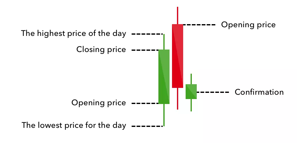
Bar charts display more information than line charts by showing the opening, high, low, and closing prices (OHLC) for each time period. Each bar consists of:
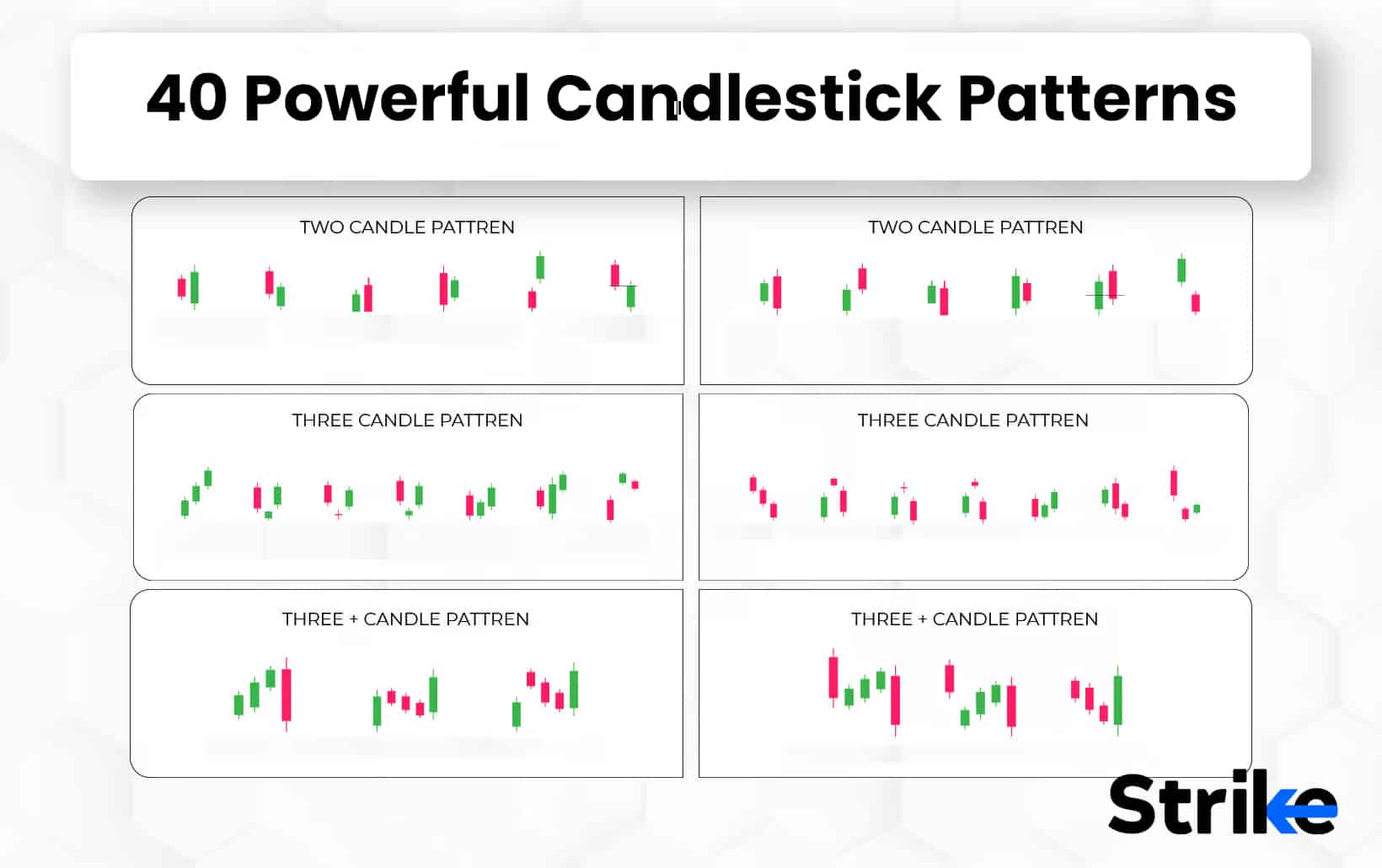
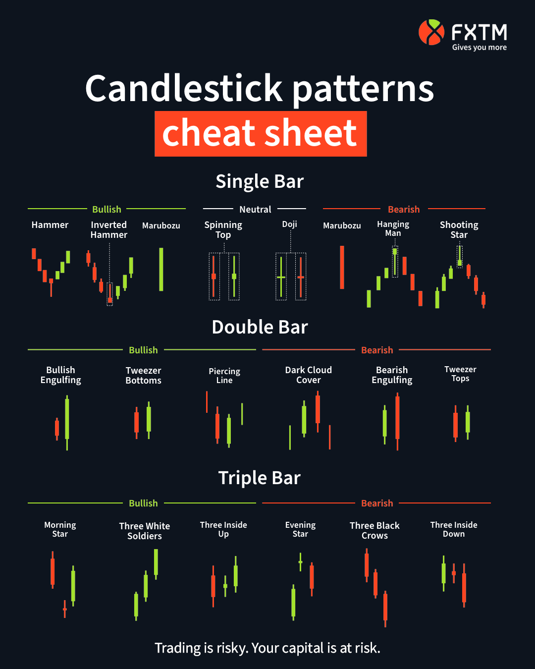
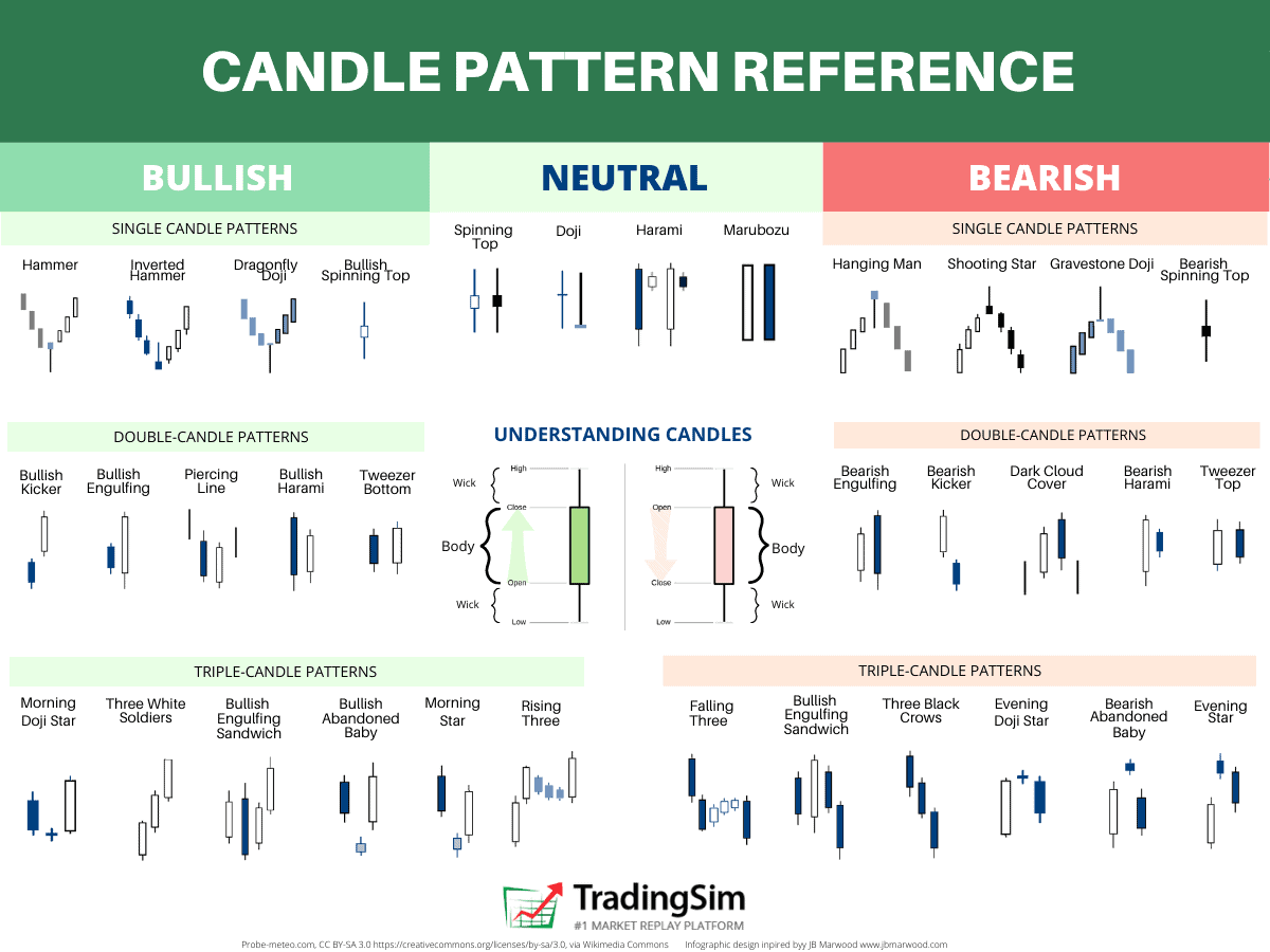
Candlestick charts, originating in 18th century Japan, also display OHLC data but in a more visually intuitive format. Their design makes patterns and market sentiment easier to identify at a glance, which is why they're the preferred chart type for most technical analysts and traders.
:max_bytes(150000):strip_icc()/spinningtopdoji-52fbdec01a5b45ea9ac5676d3ab45a8e.jpg)
Various candlestick types showing different market conditions.
Understanding the components of a candlestick is essential for interpreting what they reveal about market conditions:
The size and proportion of these components provide valuable insights:
The fundamental distinction between candlesticks is whether they're bullish or bearish:
A bullish candlestick forms when the closing price is higher than the opening price, resulting in a filled or colored body. It indicates buying pressure and potential upward momentum.
Characteristics:
A bearish candlestick forms when the closing price is lower than the opening price. It indicates selling pressure and potential downward momentum.
Characteristics:
Volume represents the number of shares or contracts traded during a specified period. It's a critical companion to price analysis, providing confirmation and context for price movements:
Important: Never underestimate the importance of volume. Price movements without corresponding volume support should be viewed with caution, as they may lack the conviction needed to sustain momentum.
Detailed illustration of various bullish and bearish candlesticks with all parts clearly labeled.
Bullish reversal patterns are formations that typically appear after a downtrend, signaling a potential shift in market sentiment from bearish to bullish. These patterns suggest that buyers are beginning to overpower sellers, potentially leading to an upward price movement.
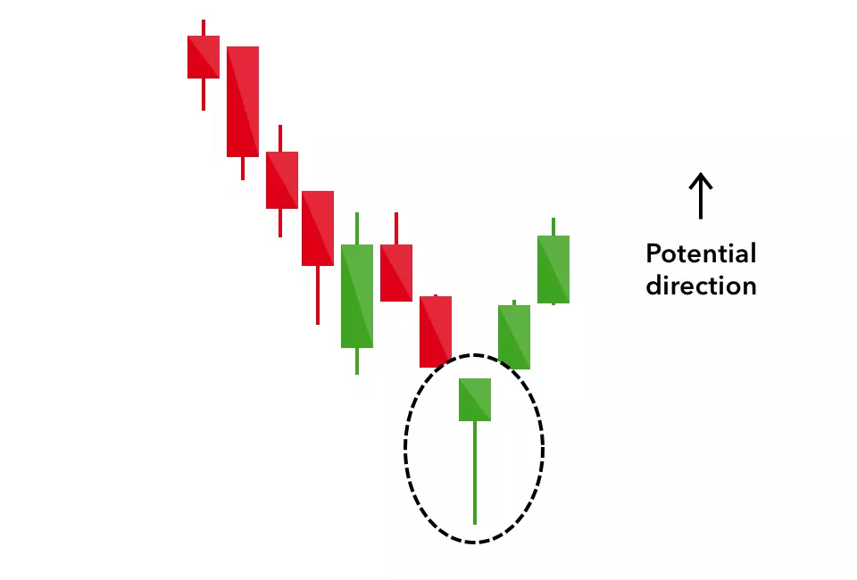
Hammer candlestick pattern forming at the end of a downtrend, followed by an upward price movement.
The hammer forms during a downtrend when selling pressure initially pushes prices lower (creating the long lower shadow), but buyers step in before the close, driving prices back up to near the opening level. This buying pressure suggests a potential reversal of the downtrend as bulls begin to gain control.
While the hammer provides a potential reversal signal, prudent traders wait for confirmation before entering a position. Confirmation may include:
Let's examine a scenario where a trader identifies a hammer pattern in a stock that has been in a downtrend:
Inverted Hammer pattern forming at the end of a downtrend, followed by an upward price movement.
The inverted hammer forms when buyers initially push prices higher during the session (creating the long upper shadow), but encounter selling pressure that brings the price back down. However, the fact that buyers were able to temporarily push prices significantly higher during a downtrend suggests weakening bearish conviction and a potential shift in momentum.
The inverted hammer is generally considered a weaker bullish signal than the hammer and therefore requires stronger confirmation:
Consider this trading scenario using an inverted hammer pattern:
Bullish Engulfing pattern engulfing the previous bearish candlestick, followed by an upward price movement.
The bullish engulfing pattern represents a decisive shift in market sentiment. After a period of downward momentum, the second day opens lower (showing continued bearish sentiment), but then buyers take control and push the price higher, closing above the previous day's open. This dramatic reversal in a single session suggests strong buying pressure and a potential trend change.
The bullish engulfing pattern is considered a relatively strong signal, especially when:
Here's how a trader might use a bullish engulfing pattern:
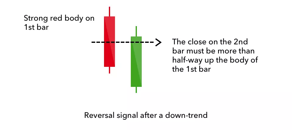
Piercing Line pattern forming within a downtrend, with the second bullish candle opening below the previous low and closing above the midpoint.
The piercing line pattern represents a shift from strong selling pressure to significant buying interest. After a bearish day, the market opens even lower the next day (possibly due to overnight pessimism), but buyers step in decisively, pushing the price up to close above the midpoint of the previous day's body. This recovery shows that bulls have regained some control and may be starting to reverse the prevailing downtrend.
Look for these factors to strengthen the piercing line signal:
A trading approach using a piercing line pattern:
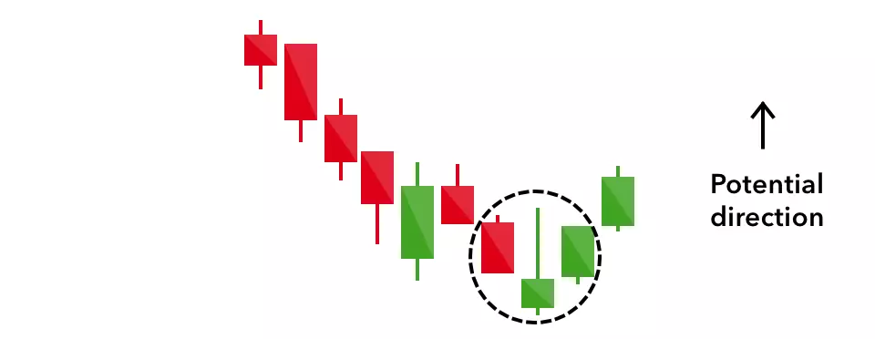
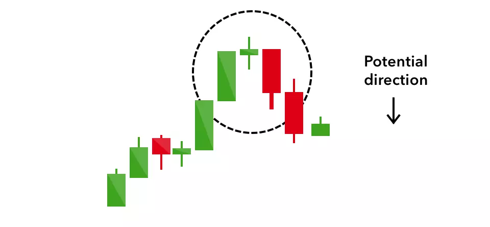
Morning Star pattern (bearish candle, small-bodied candle, bullish candle) forming at the bottom of a downtrend.
The morning star represents a clear transition from bearishness to bullishness:
This three-day transition from bearish to indecision to bullish suggests a significant shift in market sentiment and a potential bottom formation.
The morning star is considered one of the most reliable reversal patterns, especially when:
Here's a practical application of the morning star pattern:
Bearish reversal patterns typically form after an uptrend and signal a potential shift from bullish to bearish market sentiment. These patterns indicate that sellers are beginning to overpower buyers, potentially leading to a downward price movement.
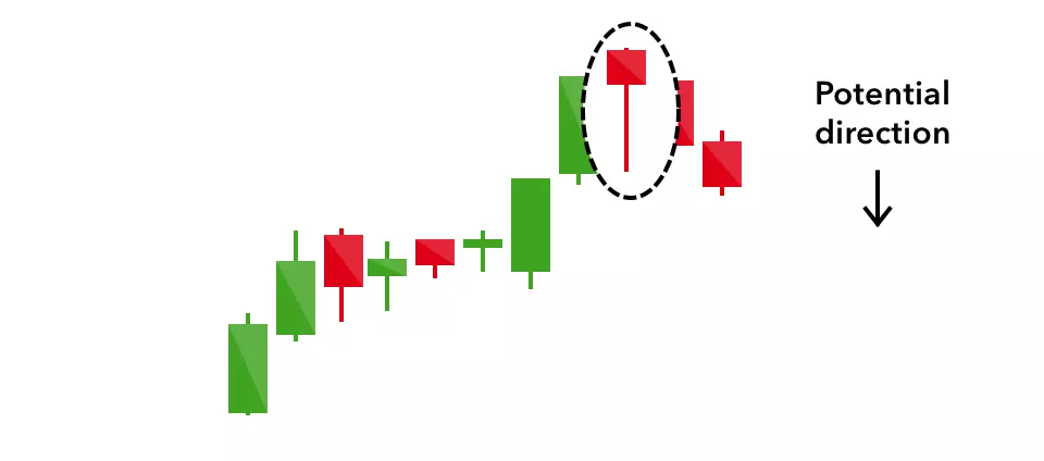
Hanging Man pattern forming at the end of an uptrend, followed by a downward price movement.
The hanging man pattern indicates that despite the ongoing uptrend, significant selling pressure emerged during the session (creating the long lower shadow). Although buyers were able to push the price back up by the close, the appearance of substantial selling in a bullish market is a warning sign. It suggests that the uptrend may be losing momentum and sellers may be beginning to gain control.
Since the hanging man only indicates potential weakness rather than confirmed reversal, traders typically look for these confirmation signals:
Here's a trading approach using the hanging man pattern:
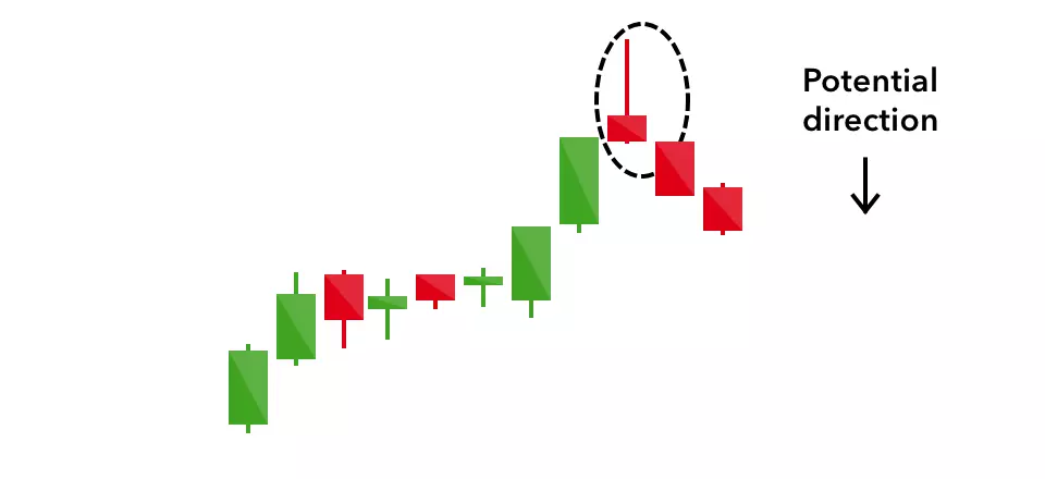
Shooting Star pattern forming at the end of an uptrend, followed by a downward price movement.
The shooting star forms when buyers initially push prices significantly higher during the session (creating the long upper shadow), but encounter strong selling pressure that pushes the price back down to near the opening level. This rejection of higher prices suggests that the uptrend may be losing momentum and that bears are beginning to overpower bulls.
To confirm the bearish signal from a shooting star, traders typically look for:
A practical application of the shooting star pattern:
Bearish Engulfing pattern engulfing the previous bullish candlestick, followed by a downward price movement.
The bearish engulfing pattern represents a decisive shift from bullish to bearish sentiment. After a period of upward momentum (symbolized by the green first candle), the market opens higher the next day (showing continued optimism), but then sellers take control and push the price lower, closing below the previous day's open. This dramatic reversal in a single session indicates strong selling pressure and suggests a potential end to the uptrend.
The bearish engulfing pattern is considered a strong reversal signal, especially when:
Here's how a trader might use a bearish engulfing pattern:
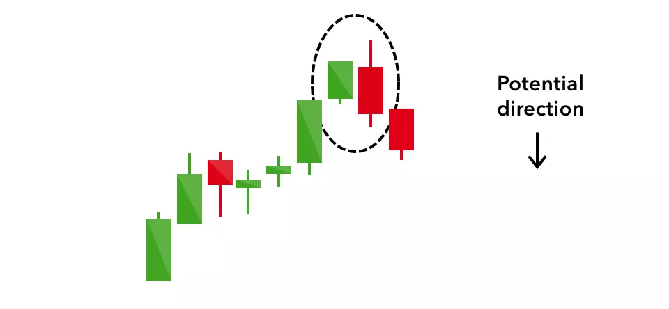
Dark Cloud Cover pattern forming within an uptrend, with the second bearish candle opening above the previous high and closing below the midpoint.
The dark cloud cover pattern reveals a significant shift in sentiment within the market:
This sharp reversal from optimism to pessimism suggests that the bulls are losing control and the uptrend may be ending.
The dark cloud cover signal is strengthened when:
A trading approach using the dark cloud cover pattern:
Evening Star pattern (bullish candle, small-bodied candle, bearish candle) forming at the top of an uptrend.
The evening star represents a clear shift from bullishness to bearishness:
This three-day transition from bullish to indecision to bearish demonstrates a clear shift in market sentiment and suggests a potential top formation.
The evening star is considered one of the most reliable bearish reversal patterns, especially when:
Here's a practical application of the evening star pattern:
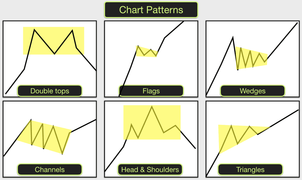
Continuation patterns suggest that a trend is pausing temporarily before resuming in the same direction. These patterns often represent periods of consolidation or market indecision, providing traders with opportunities to enter positions in the direction of the prevailing trend.
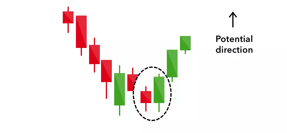
Various types of Doji candles showing market indecision.
The doji represents perfect equilibrium between buyers and sellers. After the session's battles, neither side has managed to gain an advantage. In the context of an ongoing trend, this can signal:
The significance of a doji depends heavily on the preceding trend and the context in which it appears.
| Doji Type | Description | Potential Significance |
|---|---|---|
| Standard Doji | Equal open and close with upper and lower shadows | Market indecision, potential pause in trend |
| Long-legged Doji | Equal open and close with long upper and lower shadows | High volatility but ultimate indecision, possible significant reversal |
| Dragonfly Doji | Equal open and close at the high with a long lower shadow | Bullish if appears at support or during downtrend |
| Gravestone Doji | Equal open and close at the low with a long upper shadow | Bearish if appears at resistance or during uptrend |
Example 1: Doji as Continuation in an Uptrend
Example 2: Doji at Resistance
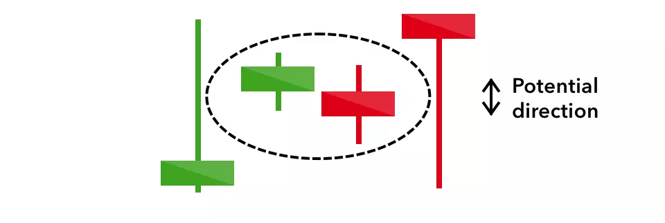
Spinning Top candles indicating indecision in the market.
The spinning top reveals a market in which both bulls and bears were active but neither could gain decisive control. The security traded both up and down during the session (creating the shadows), but closed not far from where it opened. This indicates uncertainty or a temporary equilibrium in the ongoing trend.
Unlike the doji, which shows perfect equilibrium, the spinning top indicates slight advantage to either bulls (if green/white) or bears (if red/black), but the advantage is minimal and doesn't signal strong conviction.
Example 1: Spinning Tops in a Range
Example 2: Spinning Top Before Continuation
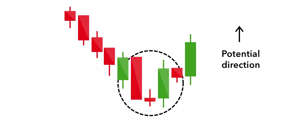
Falling Three Methods pattern within a downtrend, followed by continued downward movement.
The falling three methods pattern represents a brief consolidation or retracement during a strong downtrend. After a significant decline (first candle), some buyers step in for short-term profit-taking or bargain hunting (middle three candles), but they fail to significantly reverse the downtrend. Sellers then regain control (fifth candle), driving prices even lower and confirming the continuation of the downtrend.
This pattern illustrates a classic corrective move within a larger trend, where the brief counter-trend movement serves only to relieve oversold conditions before the primary trend resumes.
Here's how a trader might use the falling three methods pattern:

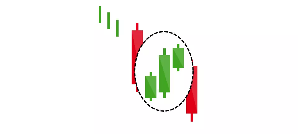
Rising Three Methods pattern within an uptrend, followed by continued upward movement.
The rising three methods pattern represents a brief consolidation or retracement during a strong uptrend. After a significant advance (first candle), some sellers enter for short-term profit-taking (middle three candles), but they fail to significantly reverse the uptrend. Buyers then regain control (fifth candle), driving prices even higher and confirming the continuation of the uptrend.
This pattern demonstrates how healthy uptrends often include small pullbacks that allow the market to digest gains before continuing higher. The containment of the retracement within the range of the first candle indicates that bears weren't strong enough to truly challenge the prevailing bullish trend.
A trading approach using the rising three methods pattern:
Confluence in trading refers to the alignment of multiple factors or signals that support a particular trading decision. When several independent signals point to the same outcome, the probability of a successful trade increases significantly. This principle applies strongly to candlestick patterns.
The power of candlestick analysis increases exponentially when multiple patterns or signals align at the same price level or time period. Rather than relying on a single pattern in isolation, successful traders look for confirmations from different technical elements.
Key sources of confluence with candlestick patterns include:
This powerful combination occurs when a hammer candlestick forms at a key support level, followed by a bullish engulfing pattern that confirms the reversal signal.
Trading approach:
This combination brings together a powerful reversal pattern with technical indicator confirmation and a break of the prevailing downtrend.
Trading approach:
This combination includes a candlestick reversal pattern, a strong trend signal from moving averages, and confirmation from volume.
Trading approach:
This combination occurs at a key resistance level, where a shooting star indicates initial rejection of higher prices, followed by a bearish engulfing pattern that confirms the reversal.
Trading approach:
This powerful bearish combination brings together a reversal candlestick pattern, an overbought technical indicator, and a classic chart pattern.
Trading approach:
This combination includes a bearish reversal pattern, a major trend reversal signal from moving averages, and a volume pattern that suggests weakening buying pressure.
Trading approach:
Charts illustrating scenarios where multiple bullish or bearish candlestick patterns appear together, strengthening the signal.
Professional Tip: When combining candlestick patterns, look for the "story" they tell collectively rather than treating them as isolated signals. The most powerful setups often show a clear progression of market psychology, from doubt to conviction or from exuberance to fear.
The foundational concept in technical analysis is the trend—the general direction in which an asset's price is moving. Being able to correctly identify the prevailing trend is crucial for successful trading.
An uptrend is characterized by higher highs and higher lows. Each rally reaches a higher level than the previous rally, and each pullback stops at a higher level than the previous pullback.
Key features:
A downtrend is characterized by lower highs and lower lows. Each decline reaches a lower level than the previous decline, and each bounce fails to reach the level of the previous high.
Key features:
A sideways trend (also called a range or consolidation) occurs when price oscillates between consistent levels of support and resistance without making significant higher highs or lower lows.
Key features:
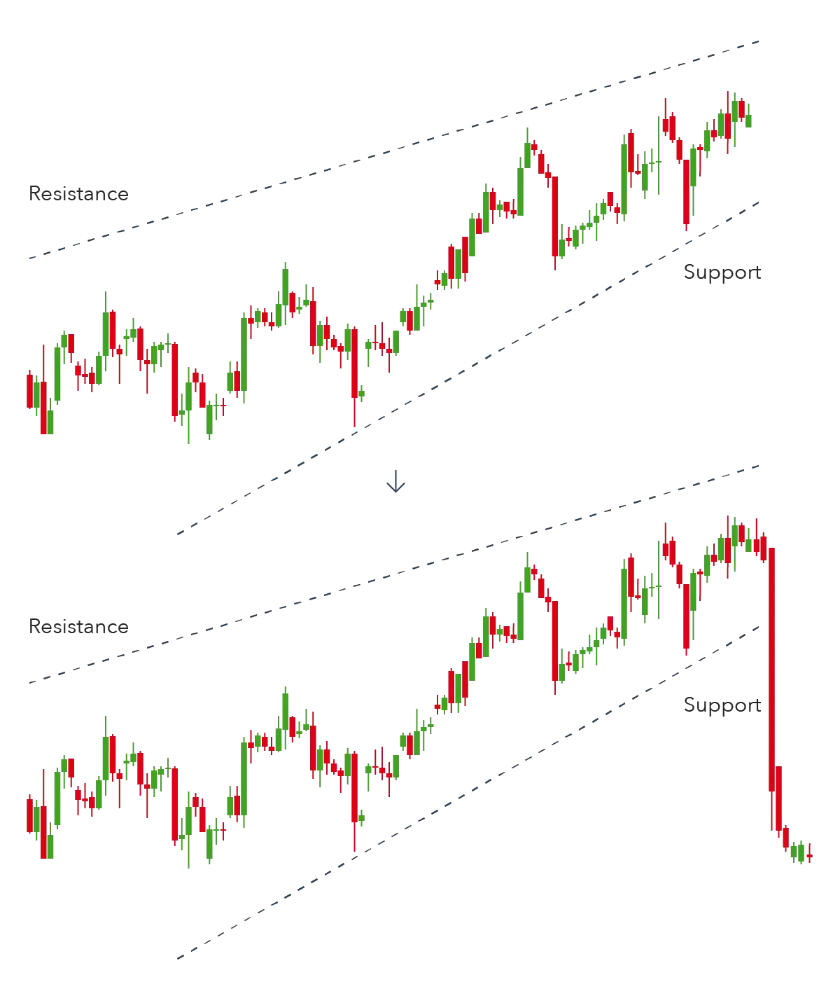
Trendlines are one of the simplest yet most powerful tools in technical analysis. When drawn correctly, they help identify the direction and strength of a trend, as well as potential reversal points.
A trendline break occurs when the price moves significantly beyond an established trendline, often signaling a potential change in the prevailing trend. The significance of a trendline break depends on several factors:
Important: Not all trendline breaks result in trend reversals. Sometimes, a break leads to a period of consolidation before the original trend resumes. Always look for confirmation before acting on a trendline break.
Trendlines offer various opportunities for traders, depending on whether they're used to trade with the trend or to anticipate reversals:
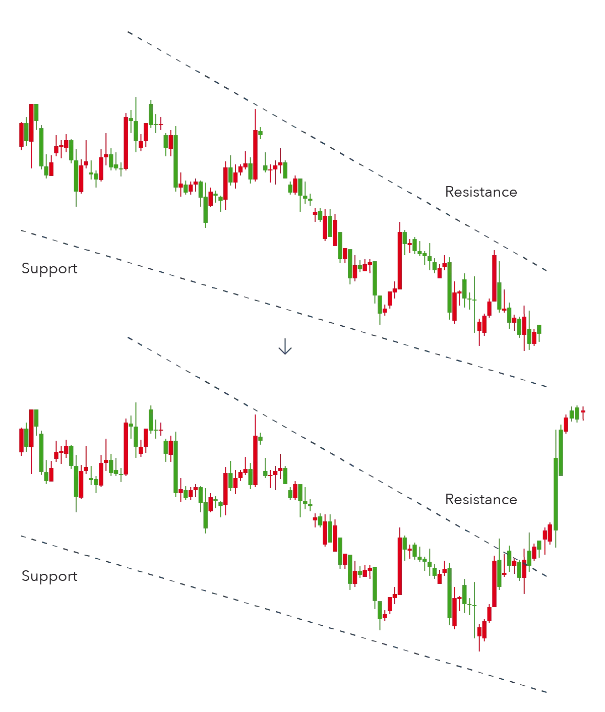
A channel is formed by drawing parallel lines that connect the highs and lows of a price trend. Channels provide a visual representation of the range within which an asset is trading, offering insights into potential support and resistance levels.
An ascending channel forms when price moves higher in an uptrend, bounded by parallel upward-sloping support and resistance lines.
Trading opportunities:
A descending channel forms when price moves lower in a downtrend, bounded by parallel downward-sloping support and resistance lines.
Trading opportunities:
A horizontal channel (also called a trading range or rectangle) forms when price oscillates between parallel horizontal support and resistance lines.
Trading opportunities:
Channels offer versatile trading opportunities, whether you're looking to trade within the channel or anticipate breakouts:
Trading Tip: Channels often work well with the "one-third rule"—instead of waiting for price to reach the exact channel boundary, consider taking partial profits when price has moved about one-third of the way from one boundary toward the other, and then let the remainder of the position run to the boundary or beyond.

Charts showing correctly drawn uptrends, downtrends, and sideways trends with trendlines and channels.
Reversal chart patterns signal that a trend is likely to change direction. These patterns typically form after extended price movements and indicate a shift in the balance of power between buyers and sellers. Identifying reversal patterns early can provide traders with high-reward trading opportunities.
:max_bytes(150000):strip_icc()/dotdash_Final_Head_And_Shoulders_Pattern_Sep_2020-01-4c225a762427464699e42461088c1e86.jpg)
Detailed illustration of a Head and Shoulders pattern with labels for neckline, shoulders, and head.
The head and shoulders pattern represents a gradual shift in market psychology:
The inverse head and shoulders follows the same psychological process but in reverse, showing waning selling pressure and increasing buying interest.
Volume plays a crucial role in validating head and shoulders patterns:
To estimate the potential move after a head and shoulders pattern completes:
This measured move approach provides a reasonable price target, though it should be adjusted based on other support or resistance levels in that area.
Effective stop-loss strategies for head and shoulders patterns include:
Example 1: Head and Shoulders (Bearish)
Example 2: Inverse Head and Shoulders (Bullish)
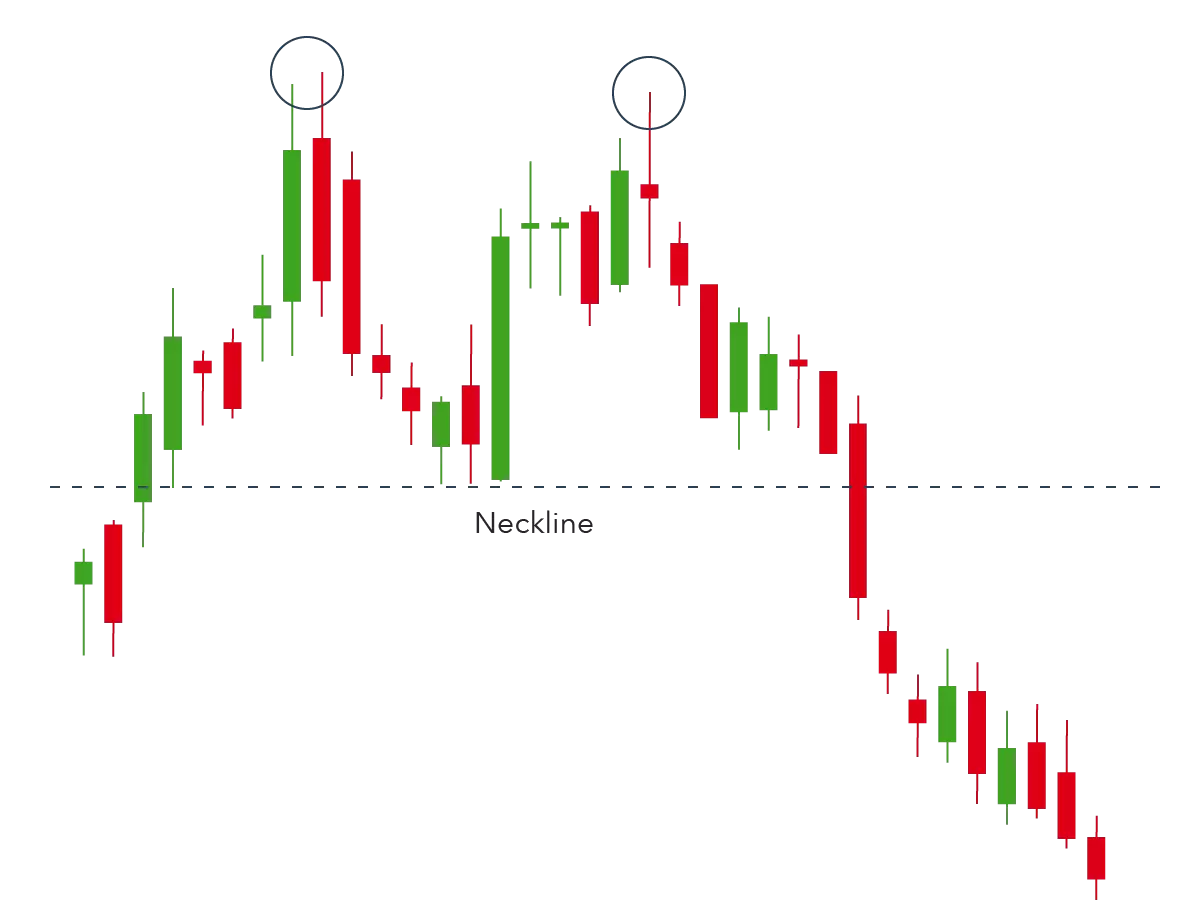
Double top pattern indicating a bearish reversal.

Double bottom pattern indicating a bullish reversal.
Double tops and bottoms represent the market's test of significant price levels and the subsequent rejection:
Ideal volume patterns for double tops and bottoms include:
The measuring technique for double tops and bottoms:
Common stop-loss strategies include:
Example: Double Top
Example: Double Bottom
Triple tops and bottoms represent persistent tests of key levels and often signal a more decisive reversal than double tops/bottoms. Each successive test of the same level reinforces its significance and demonstrates the market's inability to break through despite multiple attempts.
The ideal volume pattern shows:
Example: Triple Top

Rounding bottom pattern indicating a gradual bullish reversal.
Rounding patterns represent a gradual, rather than abrupt, change in market sentiment:
Example: Rounding Bottom
V-patterns represent extreme market conditions and sudden shifts in sentiment:
V-patterns present unique challenges for traders:
Example: V-Bottom
Continuation patterns indicate a temporary pause or consolidation in the prevailing trend before it resumes in the same direction. These patterns typically represent periods where the market is gathering strength for the next move or where profit-taking creates a temporary equilibrium between buyers and sellers.
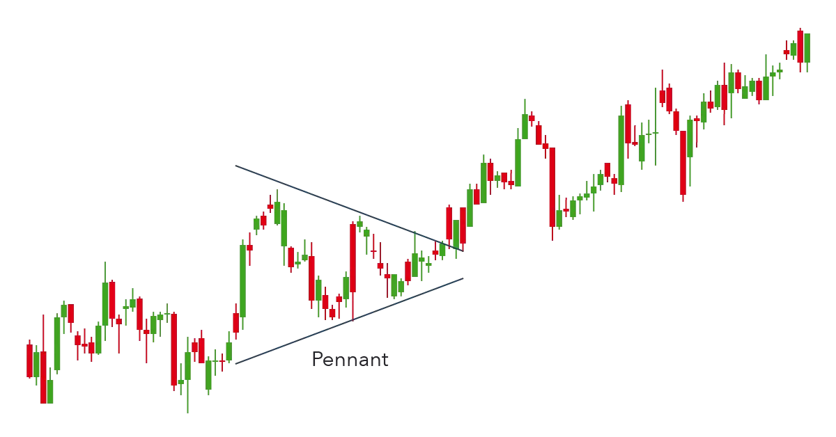
Pennant pattern forming after a strong upward move, indicating a bullish continuation.
Flags and pennants represent temporary pauses in strong trend moves:
To confirm a valid breakout from a flag or pennant:
The measuring technique for flags and pennants:
This "measuring principle" typically provides a minimum target, with the actual move potentially extending further if conditions are favorable.
Common stop-loss strategies include:
Example 1: Bullish Flag
Example 2: Bearish Pennant
Rising wedge pattern typically indicating a bearish move to come.
Falling wedge pattern typically indicating a bullish move to come.
Wedges represent a gradual shift in the balance between buyers and sellers:
To confirm a valid breakout from a wedge:
Example: Rising Wedge as Continuation Pattern
Example: Falling Wedge as Continuation Pattern
Rectangles represent periods of equilibrium and indecision in the market:
Example: Bullish Rectangle